
BOLD’s Brands in Action
Social Media & Content Design
BOLD Agency is FIU’s student-run PR and advertising agency, where students get real-world experience working with local and national clients. As a Design Specialist, I’ve created visual content that goes beyond aesthetics—each design is a tool for storytelling and brand-building.
From JQ Foundation to Rita’s Italian Ice and Baptist Health, I’ve helped shape brand identities through strategic, engaging, and creative content. These aren’t just posts—they’re crafted moments that connect brands to people with purpose and personality.

JQ FOUNDATION
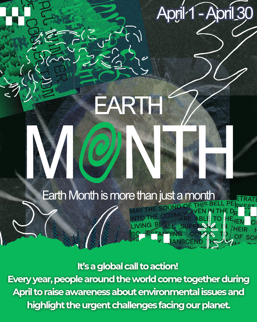
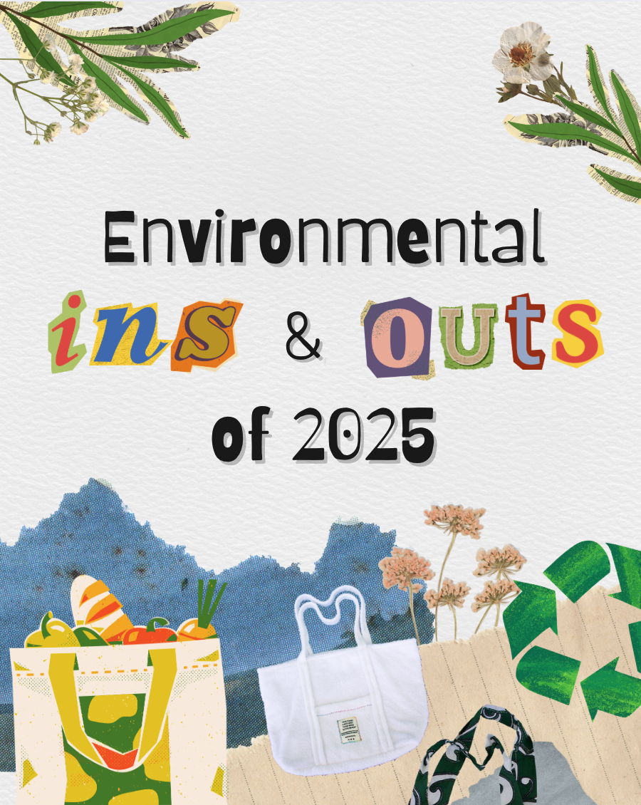
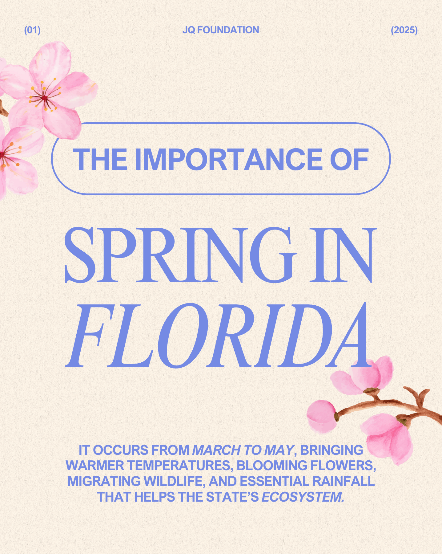
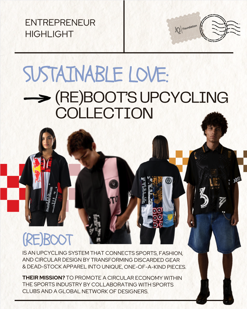
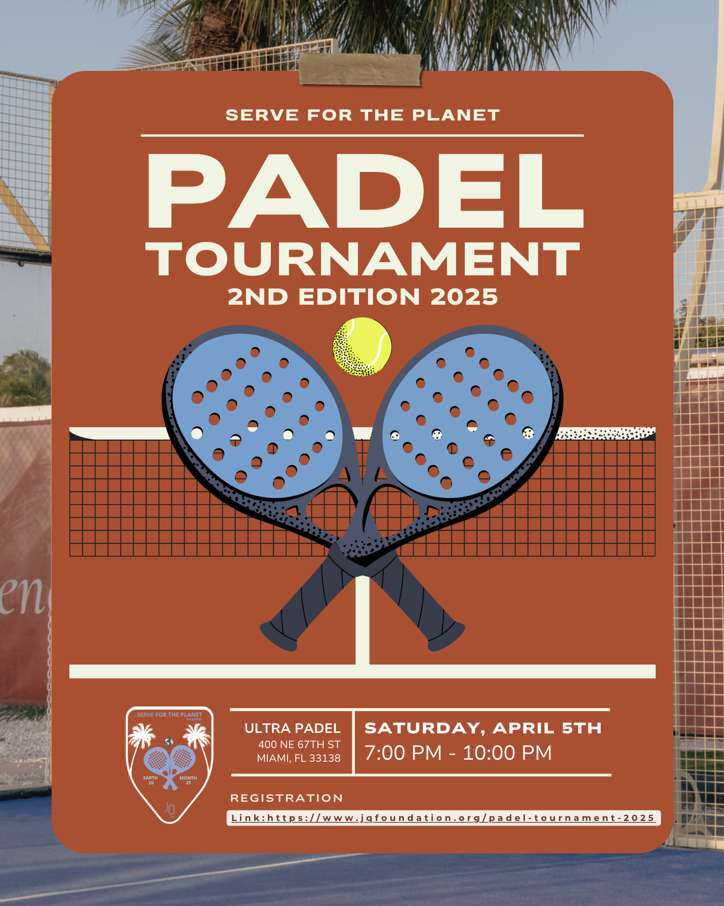
Design becomes purpose when it reflects a mission. For JQ Foundation—a youth-led nonprofit promoting sustainability and environmental education—I created visual content that brings their values to life. Each piece was crafted to elevate their identity and inspire action, from park cleanup campaigns to event promotions and Earth-centered reminders. Through a clean, vibrant aesthetic and clear messaging, these designs echo JQ’s commitment to shaping a greener, more conscious generation.
-
![]()
Remember Earth
-
![]()
Earth Month
-
![Trends]()
Trends
-
![]()
Informational & Educational
-
![Partnership]()
Partnership
-
![]()
Informational & Educational
-
![]()
Park Cleanup
-
![]()
Meet the Founders
-
![]()
Padel Tournament


Before & After
We wanted JQ’s feed to truly reflect their mission and youthful energy. By updating the color palette, layout, and overall visual direction, we created a more engaging, consistent, and on-brand presence that brings their environmental message to life.
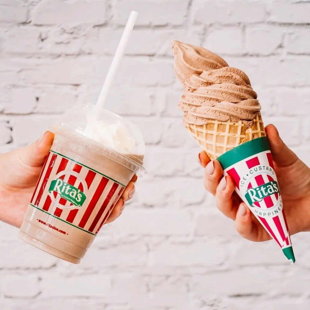
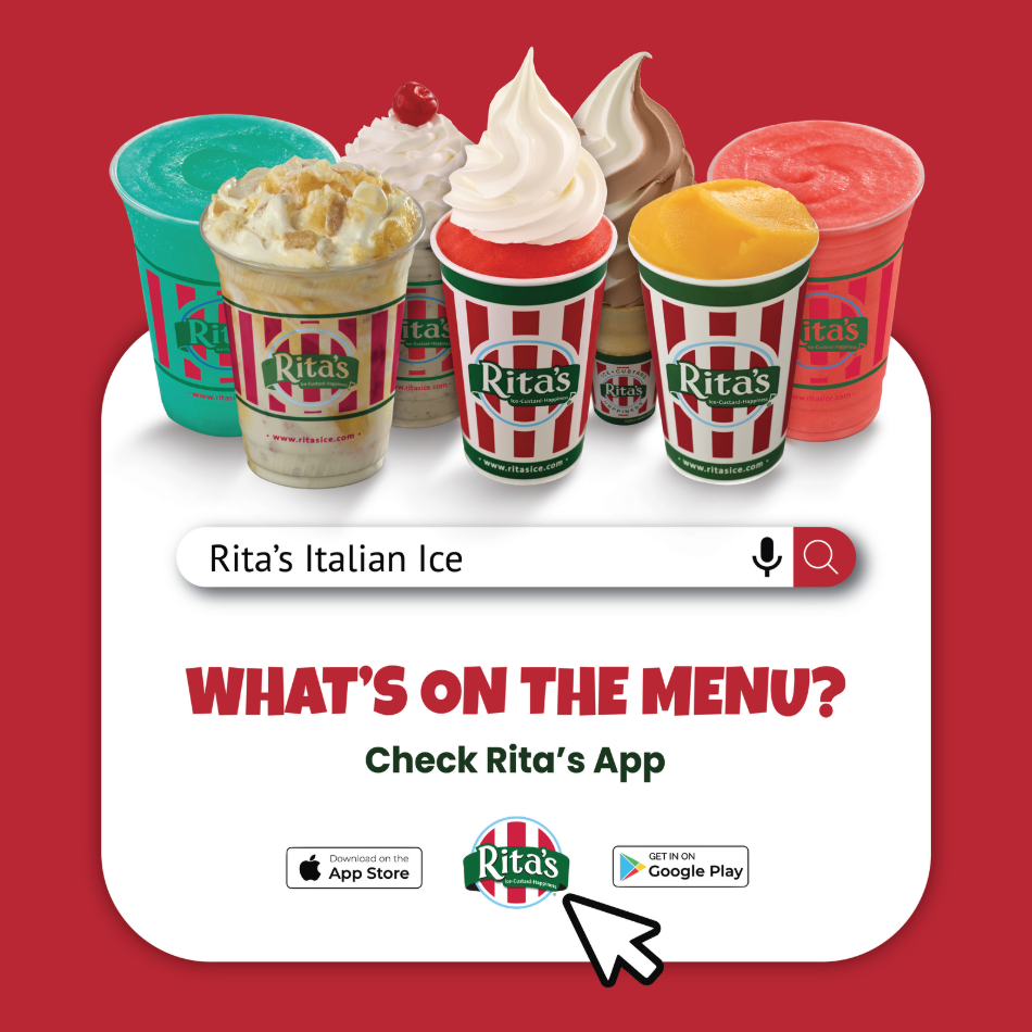
RITA’S ITALIAN ICE
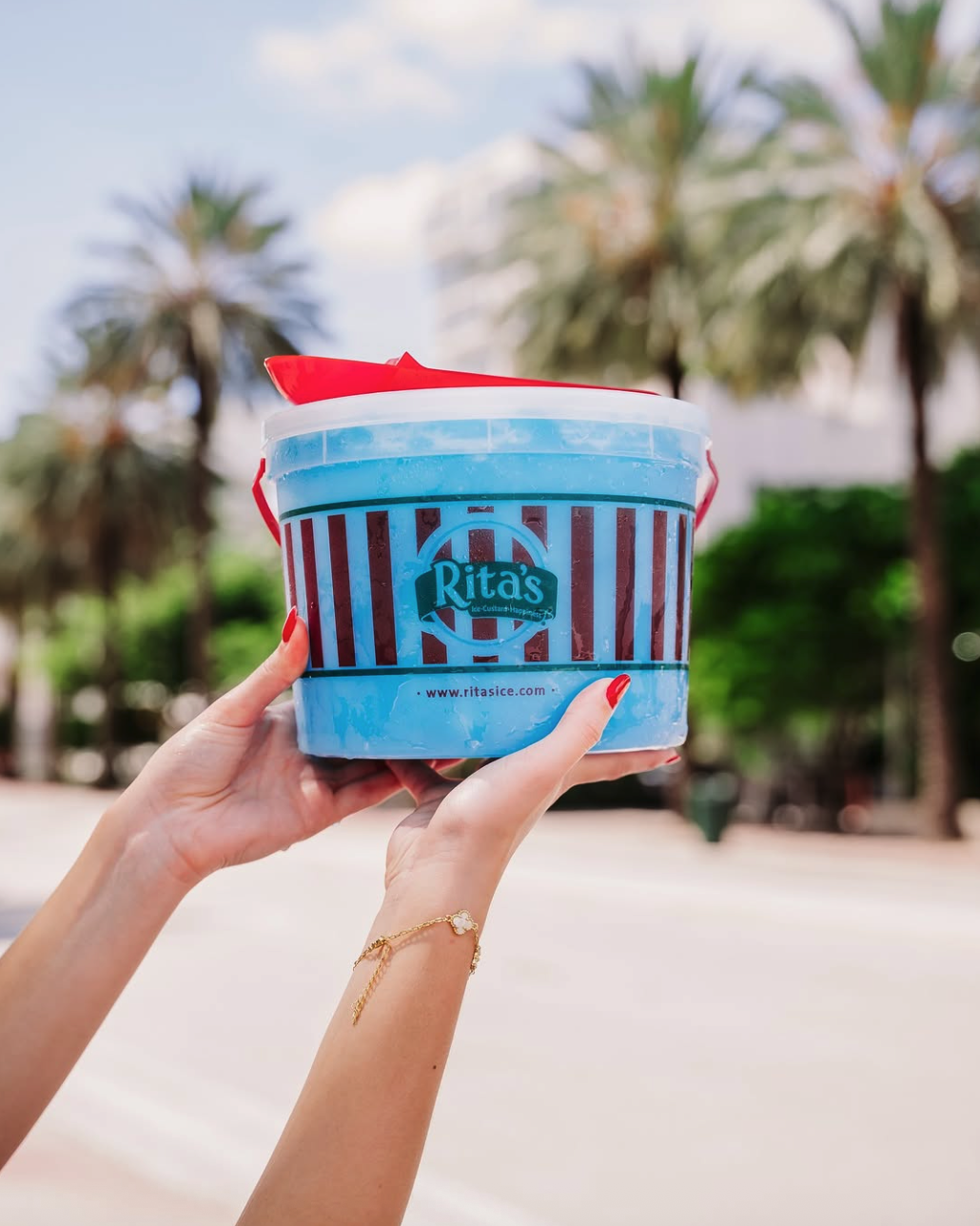
Rita’s is a beloved frozen treat brand known for its colorful Italian ices, creamy custards, and joyful vibe. With a fun, family-friendly spirit, Rita’s brings a little happiness to every cup. For this project, we focused on creating fresh, engaging social media content that highlighted key aspects of the brand.
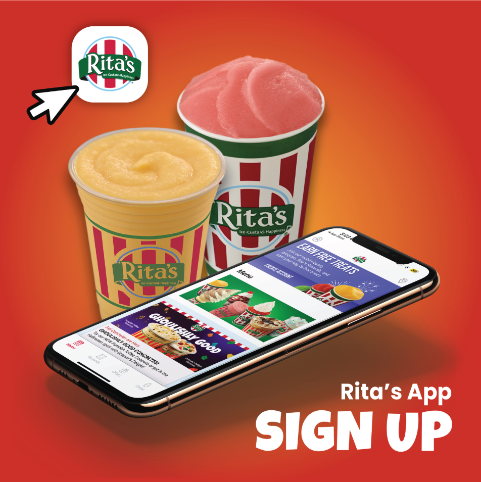
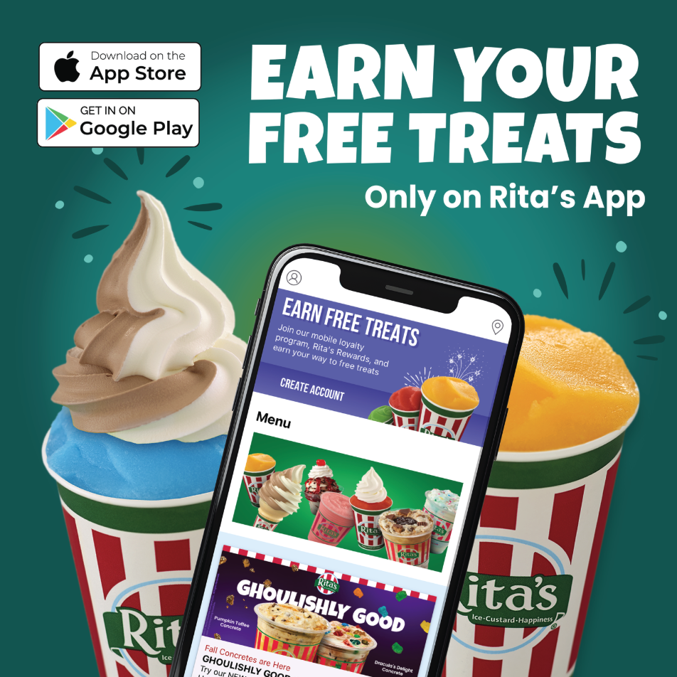
We created content to promote the Rita’s app, highlight their catering services, and showcase their frozen treats with bold, eye-catching visuals. The goal was to make Rita’s stand out by capturing its fun, colorful, and feel-good energy.
-
![]()
Rita's App
-
![]()
Gallon To Go
-
![Remember Earth]()
Free Treats
-
![]()
Milkshake & Frozen Custard
-
![]()
Menu
-
![]()
Italian Ice


Before & After
We gave Rita’s feed a fresh, vibrant update to better reflect the brand’s fun personality. By refining the visuals and layout, the new look is more colorful, engaging, and aligned with the joy their treats bring.